Creating visually pleasing shipment information for customers of a clothing brand. Responsive Desktop and Mobile website.
Role: UX UI Designer and Researcher.
Tools: Figma, Miro, Adbobe CC, Mural
Sector: E-commerce, Fashion
Project Overview
The challenge for this project was to integrate shipment statuses into the Order and Order Details page for Dungaro's Mobile and Desktop Website. Thus, improving the User Experience and Visual design.
User Journeys
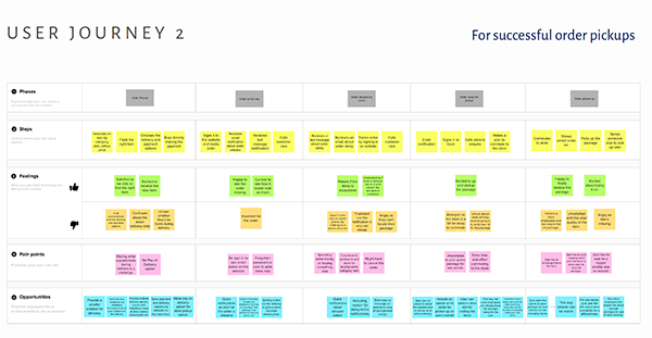
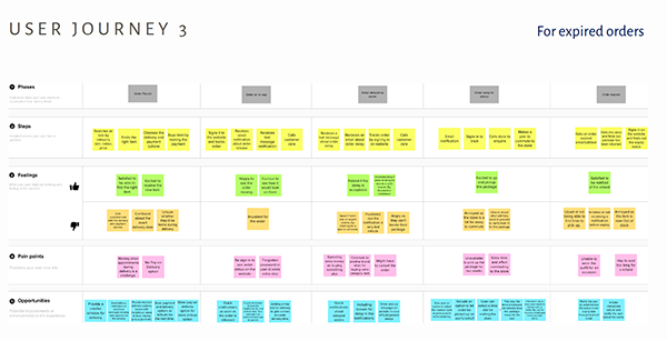
To get a deeper understanding of the current experience of the customers, I created user journeys. Analysing the high-level steps that the user takes, I mapped out their pain points and problems. This led to potential improvements and enhancements to the online ordering experience.

Competitor Analysis
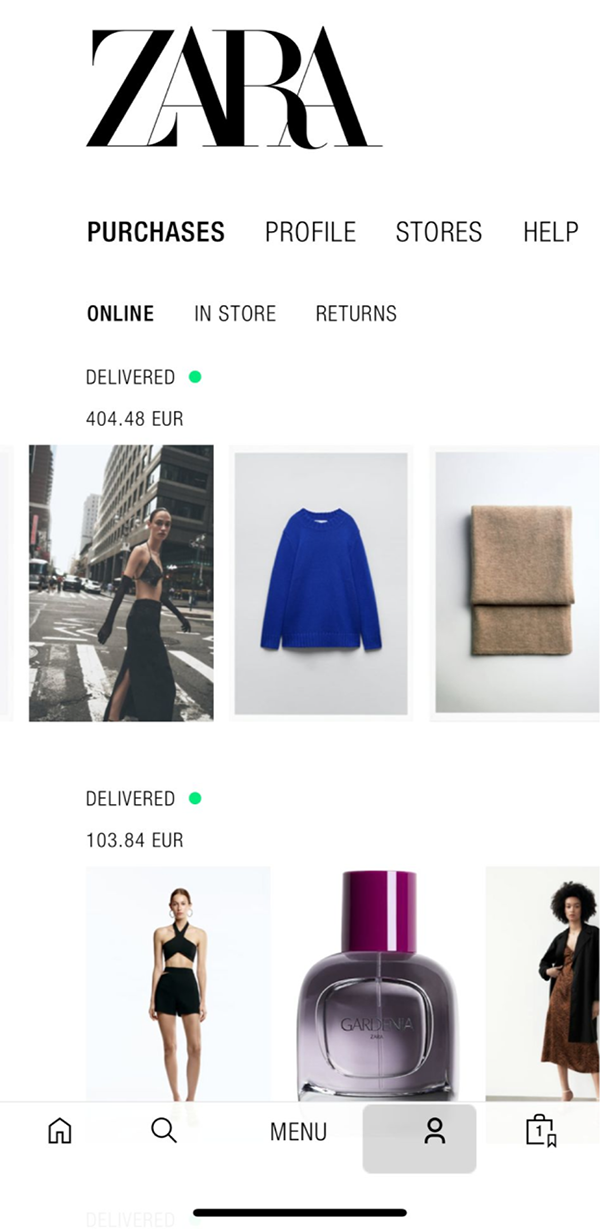
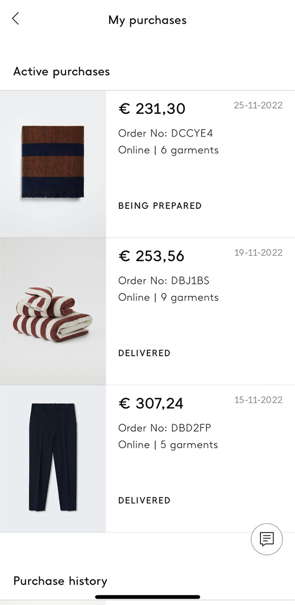
To consider the best practices and explore the strengths and weakness of the leading brands, competitor analysis helped me to ideate further on the orders section.
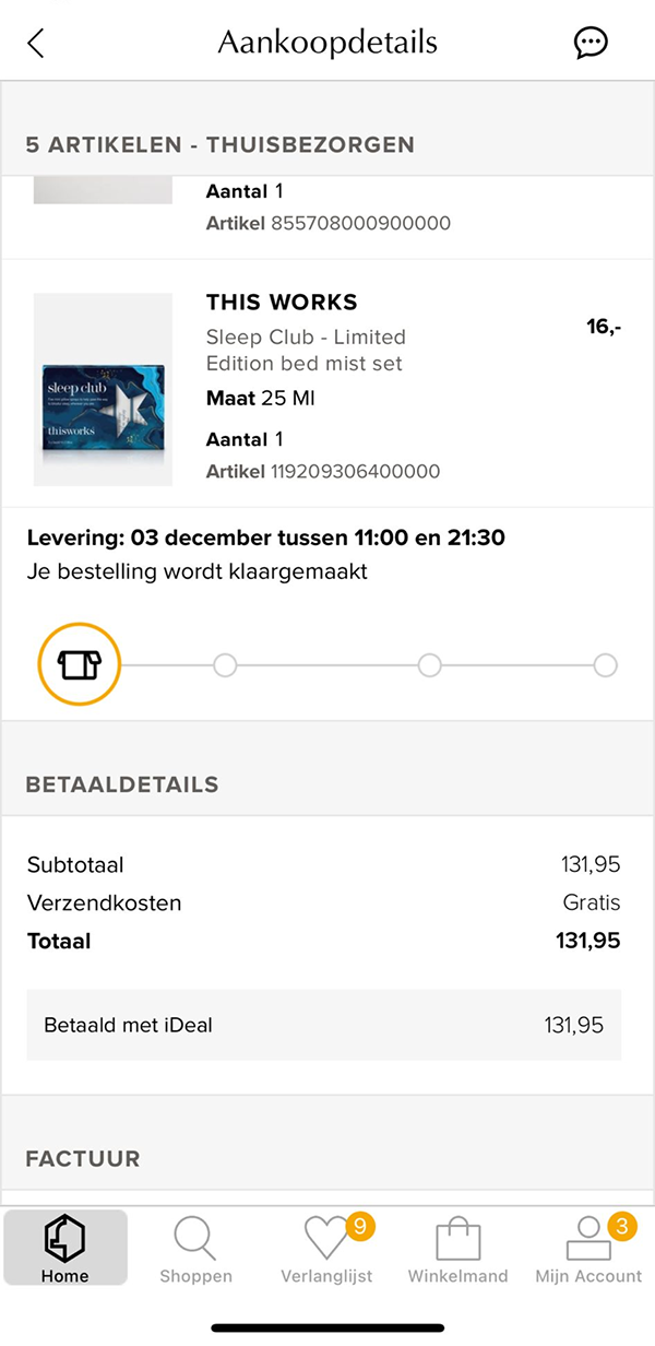
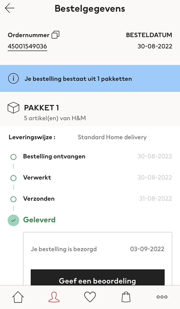
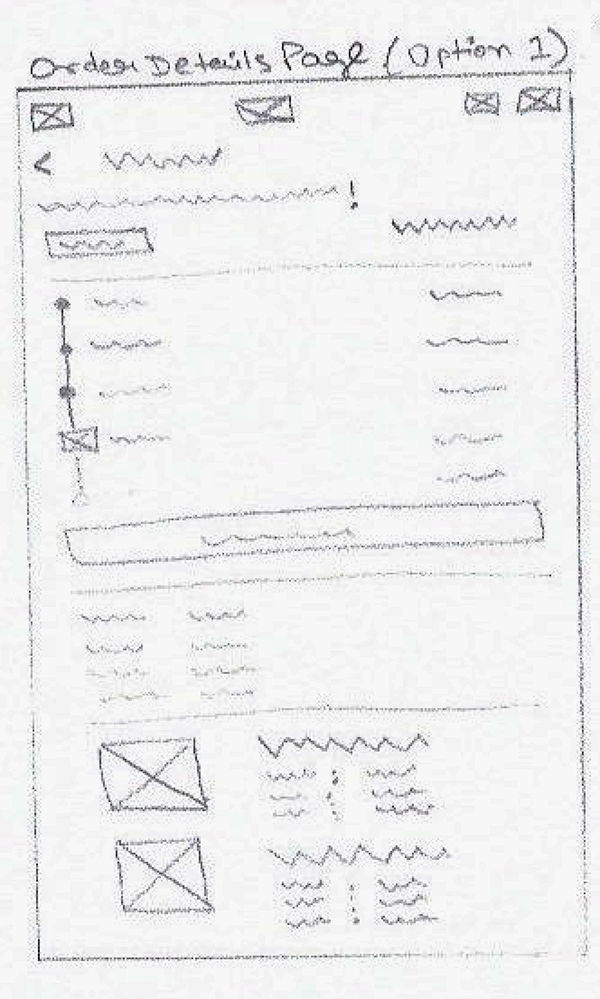
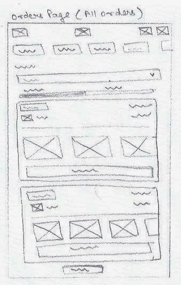
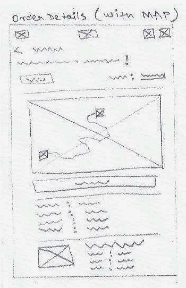
Shipping Status Table & Lo- FI Wireframe Sketches
To have a better understanding and overview of the various stages in the shipping process and to get an early visual understanding and communicate ideas with stakeholders.

High Fidelity Mockups - Mobile
Desktop Versions
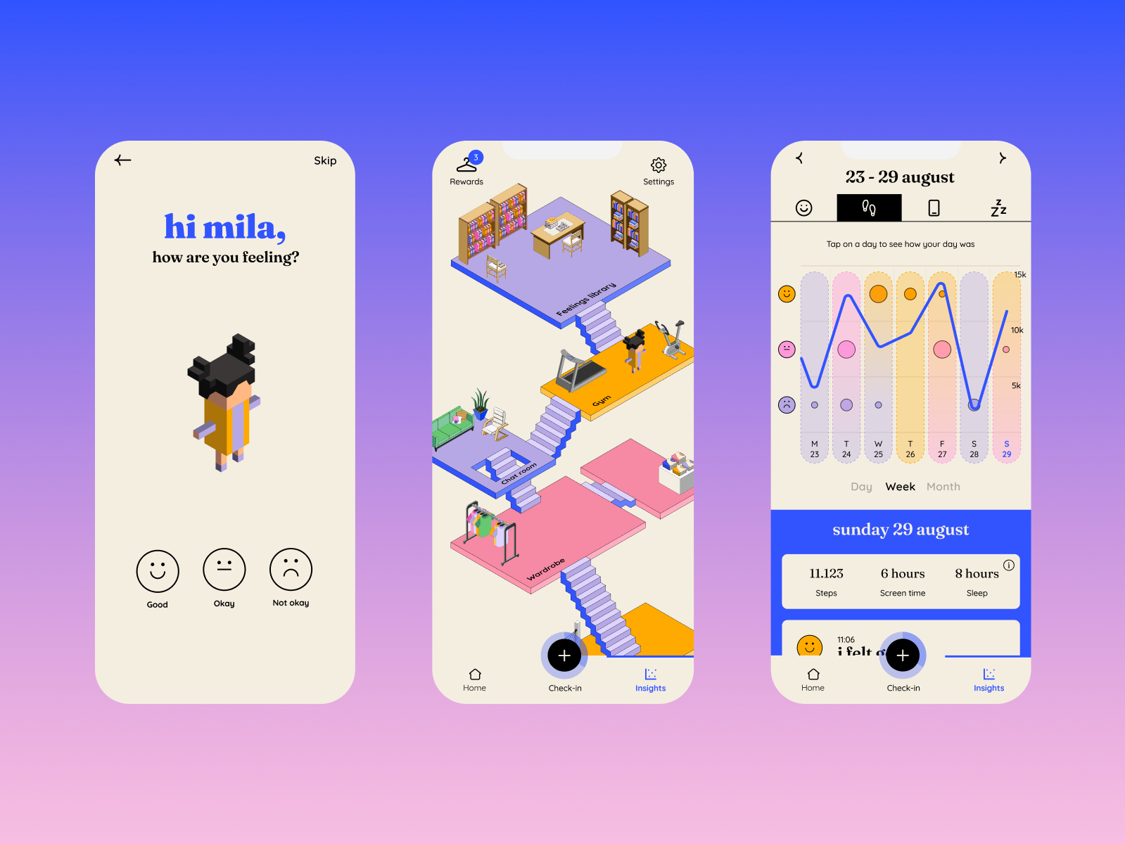
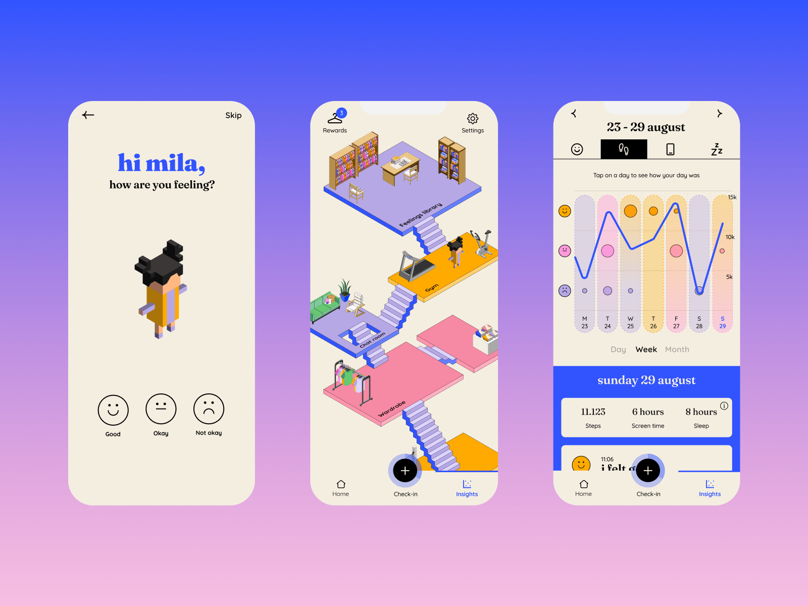
I extended and further developed the existing app by creating a virtual world within feelee where users create an avatar together with their personal profile and can navigate through feelee by visiting different “rooms”. By checking in and doing exercises, they collect rewards through which they can unlock new items.
Order Details Page

